
Artists sometimes unify their design by repeating in their artwork such elements as line, shape, form, texture, value, or color. In this way, a person’s eye notices the similarities, and the brain groups them together as like objects. An example of this is found in a photograph by Nathalie Chaput.
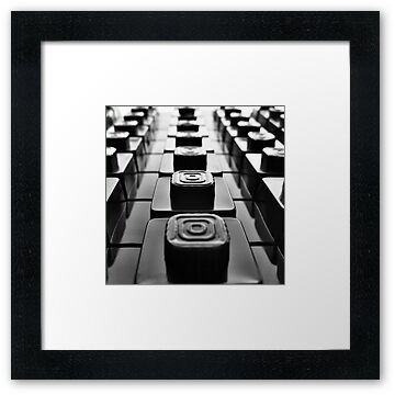
2) Variety

Variety is also used in artwork as a principle of design. This can be seen in the different shaped and colored squares in the artist Seko’s picture.

Variety can also be achieved through transitions from one state to another; this can be in the form of a color being changed to another or a line changed into a shape or character. One such example of a transition of color is found in Helen Frankenthaler’s Viewpoint II.

Contrast, an abrupt change in a piece, is often used as another type of variety. It’s often used to add to our appreciation of both things being compared. A big contrast in art can be seen in Hal Sager’s gourd masks.
Here we can contrast the smoothness of the face to the rough, sharp sticks and horns coming out of the bottom and top of the mask. Since this piece makes us continuously look and compare the different features in this mask, it significantly contributes to the unity of such a work of art.
Here we can contrast the smoothness of the face to the rough, sharp sticks and horns coming out of the bottom and top of the mask. Since this piece makes us continuously look and compare the different features in this mask, it significantly contributes to the unity of such a work of art.
3) Rhythm 

A certain element used in art – such as a line, form, or color – can be repeated visually so that the eye can pick out these recurring patterns, thus creating rhythm in a piece. An example of such rhythm is found in Robert Delaunay’s Rhythm, Joie de Vivre.
4) Balance
Balance is an important thing to a person’s eye. When we look at pieces of art, we tend to want the elements in that artwork to be distributed in a way that creates balance. That is why artists use balance in their work as a design principle.
There are three different types of balance in artwork: symmetrical or formal balance, radial balance, and asymmetrical or informal balance.

Symmetrical balance is where there is the balancing of equal forces around a central point or axis. Such an example can be found in a photograph of a modern Middle Eastern hotel staircase.

Radial balance is where elements are symmetrically arranged around a central point, as in the Eastern madala made for religious purposes.

Asymmetrical balance is when weights of dissimilar areas counterbalance each other. For example, a large, light area may be balanced by a small, dark area, with the central point off-centered. An example highlighting asymmetrical balance is found in Van Gogh’s Starry
Starry Night.
5) Compositional Unity

Compositional unity is where artists create strong attachments between elements to hold them together. One way this can be done is by using an implied triangle, such as the ones visualized in Andreas Rocha’s Chinese Junk.

6) Emphasis
Emphasis is the predominance of one area or element in design. By such emphasis, one part of a work may be isolated for special attention, thus making the whole piece of art more dramatic. Such an emphasis in color is shown in the photograph Today I Shall Be Radiant.

7) Economy
Economy refers to the ability to successfully present only a minimum amount of information in a piece of art. Artist Liang Kai is very skilled at making paintings by this sort of design, which is seen in his painting Two Crows and a Weeping Willow.
8) Pro portion
 portion
In composing a successful piece of art, all parts should be in pleasing proportions to one another. For example, in a picture of a human, we expect the arms, head, and feet to be a certain size in relationship to the rest of the body. This can be seen in many human sculptures, such as Michelangelo’s David.
9) Relationship to Environment

A piece’s relationship to its environment can have much effect on how we see the artwork. For example, Julian Beever’s three-dimensional sidewalk art would not have the same effect if it were to be drawn and placed in a museum.
So from this description of these many different principles of design, we can see how art can be used to unify a work of art and thus draw the viewer’s attention and liking to the piece.
No comments:
Post a Comment