Sunday, March 28, 2010

Chapter 3: Organizing Principles of Design

Have you ever wondered what it is in a piece of art that holds a work together? What it is that makes the picture effective? What emphasizes the unity in such artwork? Theorists have distinguished a number of principles that contribute to this: repetition, variety or contrast, rhythm, balance, compositional unity, emphasis, economy, and proportion, as well as the piece's relationship to environment. Here each of these principles of design will be discussed and shown.

Organizing Principles of Design

1) Repetition
Artists sometimes unify their design by repeating in their artwork such elements as line, shape, form, texture, value, or color. In this way, a person’s eye notices the similarities, and the brain groups them together as like objects. An example of this is found in a photograph by Nathalie Chaput.

2) Variety

Variety is also used in artwork as a principle of design. This can be seen in the different shaped and colored squares in the artist Seko’s picture.
Variety can also be achieved through transitions from one state to another; this can be in the form of a color being changed to another or a line changed into a shape or character. One such example of a transition of color is found in Helen Frankenthaler’s Viewpoint II.


Contrast, an abrupt change in a piece, is often used as another type of variety. It’s often used to add to our appreciation of both things being compared. A big contrast in art can be seen in Hal Sager’s gourd masks.

Here we can contrast the smoothness of the face to the rough, sharp sticks and horns coming out of the bottom and top of the mask. Since this piece makes us continuously look and compare the different features in this mask, it significantly contributes to the unity of such a work of art.
3) Rhythm
A certain element used in art – such as a line, form, or color – can be repeated visually so that the eye can pick out these recurring patterns, thus creating rhythm in a piece. An example of such rhythm is found in Robert Delaunay’s Rhythm, Joie de Vivre.
4) Balance
Balance is an important thing to a person’s eye. When we look at pieces of art, we tend to want the elements in that artwork to be distributed in a way that creates balance. That is why artists use balance in their work as a design principle.
There are three different types of balance in artwork: symmetrical or formal balance, radial balance, and asymmetrical or informal balance.
Symmetrical balance is where there is the balancing of equal forces around a central point or axis. Such an example can be found in a photograph of a modern Middle Eastern hotel staircase.

Radial balance is where elements are symmetrically arranged around a central point, as in the Eastern madala made for religious purposes.

Asymmetrical balance is when weights of dissimilar areas counterbalance each other. For example, a large, light area may be balanced by a small, dark area, with the central point off-centered. An example highlighting asymmetrical balance is found in Van Gogh’s Starry
Starry Night.


5) Compositional Unity
Compositional unity is where artists create strong attachments between elements to hold them together. One way this can be done is by using an implied triangle, such as the ones visualized in Andreas Rocha’s Chinese Junk.
6) Emphasis
Emphasis is the predominance of one area or element in design. By such emphasis, one part of a work may be isolated for special attention, thus making the whole piece of art more dramatic. Such an emphasis in color is shown in the photograph Today I Shall Be Radiant.
7) Economy
Economy refers to the ability to successfully present only a minimum amount of information in a piece of art. Artist Liang Kai is very skilled at making paintings by this sort of design, which is seen in his painting Two Crows and a Weeping Willow.


8) Proportion


In composing a successful piece of art, all parts should be in pleasing proportions to one another. For example, in a picture of a human, we expect the arms, head, and feet to be a certain size in relationship to the rest of the body. This can be seen in many human sculptures, such as Michelangelo’s David.


9) Relationship to Environment

A piece’s relationship to its environment can have much effect on how we see the artwork. For example, Julian Beever’s three-dimensional sidewalk art would not have the same effect if it were to be drawn and placed in a museum.
So from this description of these many different principles of design, we can see how art can be used to unify a work of art and thus draw the viewer’s attention and liking to the piece.


Chapter 2: Visual Elements

When you view a piece of art, what do you look at? At the image as a whole, or piece by piece?Most of the time, people simply look at the picture as a whole. But in reality, there is so much more to a piece of art; there are the different elements of design, such as line, shape and form, space, texture, value and lighting, color, and time. Here, as was discussed in chapter 2, I'm going to talk about those different elements of design.

Elements of Design


1) Line

Lines can be seen in artwork all around. Though it's easiest to see lines in works that are mostly linear and two-dimensional, it is also seen in more complex works of art, such as the edges of sculptures. This is very evidently seen in the Washington Monument. There are different types of lines in art, such as implied line, descriptive line, expressive line, and directional line.


Implied lines are lines that aren’t physically created but are suggested by an artist. By looking at the work of art, the viewer can perceive lines where there aren’t any. Such an example of this is found in William Blake’s Glad Day.
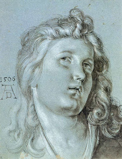


Descriptive line is line that tells the physical nature of the object we see and how it exists in space. It is seen in the illusion of three-dimensional form in two-dimensional portraits, such as Albrecht Durer’s Head of an Angel.

Line can also have expressive qualities. For example, if lines are smooth and without sharp curves or turns, it can give one a sense of calmness. If, however, lines do have sharp curves, it could give the sense of excitement, anger, or danger. From lines we can often times sense the feelings that the artist is trying to express.


Directional lines, as the name implies, are lines mainly used to direct the viewer’s attention to a certain direction, such as an anonymous artist’s rendition of the Jackson State subway platform.


2) Shape and Form


Shape and form can refer to the two- and three-dimensional works of art, respectively. Shapes are relatively flat areas. Artists work with both hard- and soft-edged shapes. In hard-edged shapes, the shapes boundaries are easily recognized and differentiated from surrounding areas. In contrast, in pieces with soft-edged shapes, it’s not always easy to tell where one shape stops and another begins, such as in the portrait made by Anne Whitfield.

3) Space

Space is the physical space that a piece of art occupies. Some three-dimensional sculptures choose to create large pieces that fill a great amount of space, and others create their own little world in a confined space. In a two-dimensional artwork, the surface is defined by a flat plane.

Some devices used to make two-dimensional pieces seem like they have depth are: placement, where objects are situated in different places around one another to make some seem closer and some seem further away; scale change, where closer objects would be larger, while far off objects would be drawn much smaller; linear perspective, where all parallel horizontal lines that recedes from the viewer goes diagonally towards the same vanishing point; atmospheric perspective, where things in the distance are less defined in form, hues, and value contrast than things closer to the viewer; point of view, where the viewer is placed in an exact position in relation to the objects in the picture; and aerial view, where the view is above the scene that is shown.


4) Texture


The texture of a work is its surface quality. It is how it would feel if we touched it. Artists use texture to influence the viewers’ response to a piece of art. Some pieces are more inviting than others; for example, a smooth piece such as a marble bust of Caesar is much more texturally inviting than a rough-looking ancient artifact.


5) Value and Light

Value is the relative lightness or darkness of an area. Such values are based on a value scale, which has ten equal steps, black on one end and white on the other. The actual lights and shadows we see on real surfaces are called local values. When values are not depicted realistically, they are called interpretive values.
Lighting is the way a subject is hit by the sun or by artificial light. Lighting can add much to a piece of art. It can reflect what time of day it is, or what kind of setting the subject is in. Reflections are also used to capture attention.

6) Color

Though color may seem just like a normal element of artwork, it has great effects on our visual receptors, emotional state, and perceptions of space. The color wheel is an important concept in art, and consists of three main hues which all others can be mixed. In art, there are different forms of color artists can use: natural and applied color, which is color we see around us and use to depict natural landscapes or objects; local color, the color something appears if seen under normal light; atmospheric color, conveying, not the colors an object is mentally perceived, but how it is when changed by the atmosphere; and interpretive color, color that is chosen as the artist’s intent rather than the real colors of the object.

7) Time

In art there can be actual movement in a piece. These types of works, where they can move through space, are called kinetic sculptures, such as the one made by David C. Roy (http://www.youtube.com/watch?v=nUuKNP6p_w0). There can also be an illusion of movement in two-dimensional pieces, such as in Fight or Flight by Saskia Ozols Eubanks.
Artists can also capture a movement in time, or can depict change through time.

So we see from all these visual elements that artists have many techniques to help convey their art in a way that will help viewers to grasp the purpose of such meaningful works.

Thursday, March 25, 2010

Chapter 1: Understanding Art

Art - "the quality, production, expression, or realm, according to aesthetic principles, of what is beautiful, appealing, or of more than ordinary significance." So said one dictionary on the definition of art. But art may be beyond what we think of it; it may not be as obviously seen as it is in a photograph or painted picture. Take everyday items, for example. Would you consider the chair you sit in as art? Would you consider the bowls and cups we use at meals as art? We are so used to seeing and using these types of "applied arts" that they are frequently forgotten as art. But indeed they are. From this example, therefore, we can see that art encompasses a wide variety of ideas and forms, some of which may not have been considered art before. Art can be considered, then, simply as anything created by human hands with a meaning or for a purpose conceived by the artist him- or her-self.


Different Types of Art


1) Two- and three-dimensional

"Two- or three-dimensional" is a general way to describe a piece of art. Two-dimensional art pieces are flat pieces of works, ones which have no depth (although they may have a built up surface from paint, the picture or image is flat). An example of two-dimensional art is the painting Impression, Sunrise by Claude Monet.


Three-dimensional pieces, however, do have depth as well as height and width. An example of three-dimensional artwork is seen in a piece of art by a student from Truman State University. This piece is called There Were All These Ripe Apples.


2) Representational and Nonrepresentational

Representational art (or figurative art) is when an artist tries to create something that represents what we see in the real world. However, there are many different degrees of realism in this type of art: absolute realism is an accurate depiction of the world around us; idealization is when an artist transforms what is seen in the real world into his or her own perfected version of the world, as in Pierre-Auguste Cot's Springtime; stylization is when an artist emphasizes the design of something rather than creating an exact representation of what they see; and abstraction is made by extracting the essence of real objects rather than an exact representation, such as seen in Georgia O'Keeffe's Jack in the Pulpit No. IV.


Nonrepresentational art (or nonobjective art) is where an artist portrays things, not from the physical world, but purely as elements of design. An example of this type of artwork is visible in Jiha Moon's Edge of Spring.

3) Fine and Applied

Fine art is art that is simply produced to be seen and experienced on an aesthetic level. It is produced to evoke different responses in viewers by how the work makes them feel emotionally, intellectually, or spiritually. Applied art, however, as mentioned before, is art that is created simply to serve some function, such as a chair is created to sit in or a vase is created to hold flowers. Though these pieces may be considered just as everyday objects, they are in fact pieces of art and can have a vast amount of variation in the design of such objects.

4) Public and Private

Public art is art that is funded by the government and public institutions for display at such places as museums, businesses, or simply outside venues for passerby to enjoy. Private art, in contrast, is art that is not owned by the government or a museum, but is art created and kept by an independent artist for intimate view and opinions.

Those are some of the different types of art seen in the world today. There are also many different contents in art, such as sociopolitical content, pieces depicting power and propaganda, pieces created for spiritual purposes, from inner experiences, and simply for the pursuit beauty. And from this chapter on understanding art, we have come to recognize and hopefully appreciate more these many different aspects to such an intriguing subject.

Sunday, March 14, 2010

Art Appreciation

This blog spot is for the Art Appreciation class at Roane State Community College. I'll post different blogs on each chapter we go over in our art book (The Art of Seeing) along with some pictures and examples of the things being discussed that specific chapter. Under my blogs there are also comment boxes where you can post responces to my blogs, so please let me know what you think about them.
Thanks!
Connory